The 40-Year UX Reversal: Why AI Brought Back the Terminal
An engineer at last night's OpenClaw networking event in Berlin dropped a truth bomb that made my co-founder and I stop mid-conversation. "We spent 40 years perfecting graphical interfaces," he said, gesturing at his phone, "just to end up talking to a blank screen again."
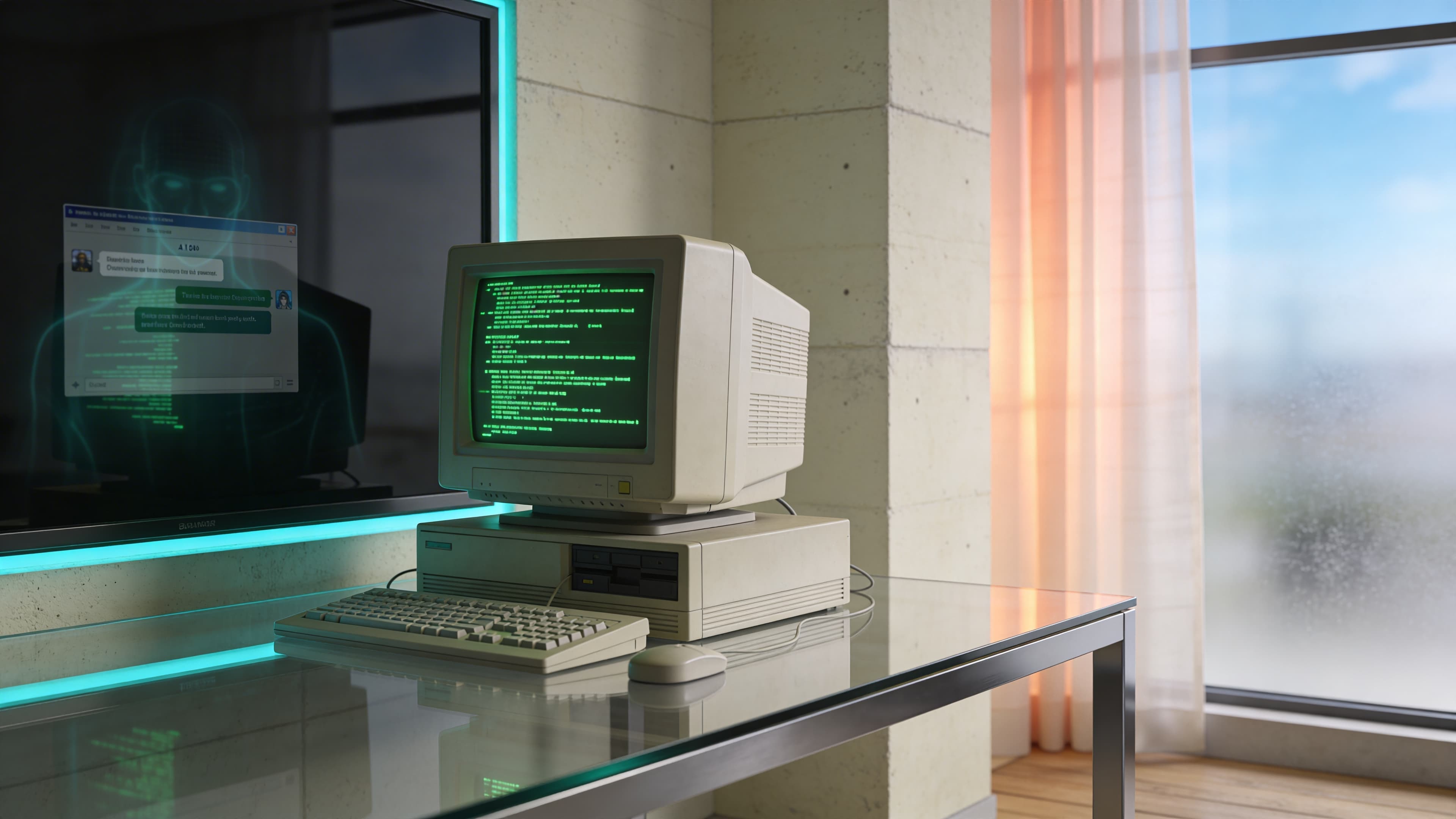
He wasn't wrong. The blinking cursor is back. ChatGPT, Claude, Mistral — they're all fancy terminals dressed up with rounded corners. While UX teams built increasingly complex button hierarchies and navigation trees, AI quietly returned us to the command line. The difference? Your grandmother can use it.
This isn't just interface nostalgia. It's a complete reversal of how work actually happens. The same technology cycle that buried the terminal under layers of visual complexity just stripped it all away. What started as Apple's GUI revolution 42 years ago became an arms race of features, menus, and micro-frictions that AI now makes feel painfully obsolete.
The invisible friction of modern software — the 12 clicks to cancel a subscription, the maze of tabs to find project status — suddenly looks absurd next to "Show me this quarter's revenue breakdown." We're witnessing the death of the graphical detour, and it's forcing a fundamental question: if the interface disappears, what objects do we actually need to work?
The 40-Year Graphical Detour
Before the mouse, there was only the cursor. Computer operators in the 1970s typed commands into terminals, learning arcane syntax to make machines respond. Then Apple's 1984 Macintosh changed everything, introducing windows, icons, and the radical idea that computing could be visual.
What followed was the greatest UX expansion in history. From 1950 to 1983, the UX profession grew from about 10 people to about 1,000 people during the mainframe era. But the real explosion came with personal computing: from 1983 to 2017, UX professionals multiplied from 1,000 to 1 million people — a thousand-fold increase driven by one mission: make computers accessible through visual interfaces.
Don Norman's 1993 coining of the "UX Architect" title marked the beginning of a systematic campaign to bury command lines under layers of buttons, menus, and navigation hierarchies. Every software company hired armies of designers to translate computer functions into clickable elements. The terminal became a relic, relegated to developers and system administrators while everyone else learned to hunt through dropdown menus.
This graphical arms race created increasingly complex interfaces. Software companies competed on feature counts, adding tabs within tabs, nested menus, and elaborate workflows. The simple text prompt that once controlled entire systems got buried under visual metaphors designed to make computing "intuitive."
The irony? All this visual complexity was meant to eliminate the learning curve of typed commands. Instead, it created disconnected systems that required users to memorize where functions lived across different applications. The clean efficiency of "delete file.txt" became a multi-step dance through file explorers, confirmation dialogs, and trash folders.
By 2020, the average knowledge worker toggled between 9.4 applications daily, navigating hundreds of buttons and menus to complete basic tasks. The graphical interface had solved the accessibility problem but created a new one: invisible friction disguised as user-friendly design.
The Return to the Blank Screen
While UX teams spent decades perfecting visual interfaces, AI quietly dismantled their work. ChatGPT launched with nothing but a text box. No menus, no navigation bars, no feature discovery tours. Just a blinking cursor waiting for natural language commands.
The simplicity was radical. Users who couldn't navigate Excel's ribbon interface suddenly generated complex spreadsheets by typing "Create a budget tracker for my freelance business." The same people who got lost in Photoshop's tool palettes described their vision and watched AI produce professional designs. 70% of users now prefer conversational assistants for faster interactions, bypassing traditional UI elements entirely.
This represents a complete inversion of interface design philosophy. More interactions are now mediated by AI, with users spending less time navigating traditional UIs and more time delegating to AI layers on top of them. The elaborate button hierarchies that required armies of UX professionals to design became obsolete overnight.
Consider the cognitive load difference. Traditional software forces users to translate their intent into the application's language — finding the right menu, selecting appropriate options, configuring settings. AI flips this dynamic. Users express intent in plain English while the machine handles translation into executable commands.
The terminal never actually disappeared. It just got buried under visual complexity that AI now renders unnecessary. Today's AI interfaces strip away the graphical detour, returning us to direct command-and-response interaction patterns. The difference lies in accessibility: where 1970s terminals required memorizing syntax, modern AI interprets natural language.
This shift fundamentally challenges how we think about human creativity and technological interaction. The AI Whiplash: Why Human Creativity is the New Premium explores how this interface simplification places premium value on human judgment rather than technical navigation skills. The blank screen isn't just back — it's become the most sophisticated interface we've ever created.
Subtraction as the New Innovation
Claude Code, GitHub Copilot, and Mistral all share the same architectural foundation: a chat interface wrapped in minimal visual design. These AI application layers function as sophisticated terminals, stripping away the feature bloat that defined software for decades. The innovation isn't what they add — it's what they remove.
This subtraction philosophy exposes the absurdity of modern SaaS design. Finding the "cancel subscription" button in most applications requires navigating through account settings, billing preferences, and deliberately obscured confirmation screens. The same task that demands 8-12 clicks becomes a single command: "Cancel my subscription." The friction wasn't accidental — it was designed to prevent user action.
Traditional interfaces force users to learn the software's organizational logic. Where does billing live? Which tab contains user preferences? AI interfaces eliminate this cognitive overhead entirely. Users express intent while the system handles execution paths behind the scenes.
The shift creates a new design philosophy where a specific, clear CTA can increase conversion rates by 161%, proving that subtracting ambiguity in interfaces drives superior user outcomes. Companies building AI-first products focus on conversation design rather than button placement, information architecture, or visual hierarchy.
This represents the death of feature discovery through exploration. Traditional software relied on users stumbling across functionality through menus and toolbars. AI applications surface capabilities through natural language, making every feature accessible through description rather than navigation.
The terminal aesthetic isn't nostalgic — it's optimal. When interaction happens through conversation, visual complexity becomes pure overhead. The blank screen forces focus on the quality of output rather than the sophistication of input mechanisms.
Modern software's invisible friction becomes painfully obvious once you've experienced conversational interfaces. 10 Operational Inefficiencies AI Can Eliminate Today details how this interface revolution transforms entire operational workflows, not just individual tasks.
Redefining the Objects of Work
When interfaces disappear, the objects of work must change with them. The physical and conceptual tools that defined professional environments — multiple monitors displaying dozens of browser tabs, desktop applications sprawled across taskbars, printed documents scattered around keyboards — become artifacts of an inefficient era.
85% of creative leaders report they reclaim at least four hours per week by using AI tools in their workflow, enabling focus on operational clarity over interface navigation. This time recovery forces a fundamental question: what do workspaces actually need when the primary interface becomes conversation?
The answer lies in stripping work down to its essential components. Jennifer Bravo, GM at ERS running three businesses across continents, discovered this when her custom AI assistant 'Maggie' replaced the constant app-switching between Asana, Gmail, and Sheets. The Jennifer Bravo case study shows how eliminating interface complexity saved 18-20 hours a week through a simplified conversational interface that connected her scattered tools into a single interaction point.
This operational transformation extends beyond individual productivity. Decision-makers can no longer hide behind bloated software purchases or complex integration projects. When AI strips away interface complexity, the quality of underlying business processes becomes immediately visible. Poor workflows that were masked by elaborate dashboards and reporting tools get exposed when users simply ask, "What's blocking our Q2 targets?"
Generative AI for design provides 50%+ time savings in prototyping and asset creation, stripping down bloated software processes to essentials. This efficiency gain forces organizations to confront how work actually happens rather than how software vendors think it should happen.
The workspace of the future contains fewer objects but demands higher operational clarity. Business Process Automation: Complete Guide explores how this interface evolution reshapes entire operational frameworks around human intent rather than software limitations.
The terminal didn't just return — it evolved into something that questions the very foundation of how we organize work itself.
The Intent Layer
The terminal's return reveals something profound: every interface between human intent and machine execution was temporary scaffolding. We built elaborate visual systems to bridge the gap between what people wanted and what computers could understand. AI just made that bridge obsolete.
This isn't about nostalgia for command lines or the death of design. It's about recognizing that the most sophisticated interface is the one that disappears entirely, leaving only pure intent and immediate execution. The blank screen forces us to articulate what we actually want rather than navigate what someone else thinks we need.
The organizations that thrive in this shift won't be those with the most polished interfaces or the most features. They'll be the ones that strip away everything between human intention and meaningful outcomes. The cursor isn't just blinking — it's waiting for you to define what work actually means when all the busywork disappears.
If you want to explore what this minimalist approach means for your team's workflows, book a free 30-min consultation to see how Agents Dynamic can remove micro-frictions and automate your operations.